
Fairway’s been a pretty big fan of Component.Studio since its original release. He recently used it for an update to one of his original contest entries: Sneeze. In this quick tutorial, Fairway walks through how he easily created a deck of 108 cards with variable icons and colors.
So, here’s the situation: I have a game with 108 cards. Most of those cards are variations on the exact same thing: ten suits each in eight different colors.

There’s two aspects about this design that would have made scripting or data merge in another tool really hard:
- The “art” on the card color changes with the color of the card.
- The “suit” follows exactly the shape of the art and the color
And, as a result, if I was creating this game before Component.Studio, it would have meant making almost every card individually by hand. I might also have been in a situation of having to create different copies of the art or figuring out some less elegant way to handle it.
Enter Component.Studio.
Getting Prepared: Art, Data and Variables
This technique does require a little bit of preparation. I’m going to assume you’re capable of logging into component.studio and creating a project.
Adding my art
After that, first things first, I prepared a set of art files. I uploaded a color and black-and-white version of each of my main germ art pieces. I made sure that each source image was the same dimension and uploaded them to a folder in the “Images & Icons” section of my project. You can click the “copy” icon to get the URLs for each of files.

My Data Set & Variables
Second, I made a data set called “Bacteria.” Within the “Bacteria” I made a bunch of “Data Set Variables.” Data Set Variables let you specify a variable and associate it with a string of some sort. You can do this by scrolling down to the bottom of the data set to the section called “Data Set Variables” and entering a “name” and a “value” and clicking the “+” sign:

For this purpose: I created one variable for each unique piece of art I wanted to use in the game. The variable then pointed to the URL of the art I stored in the “Images & Icons.” For instance, the variable {$PSB} would point to the URL for the image for the “Purple Spike Ball” image. You can name them whatever you want.
This approach means that should I ever want to change the image, I need to change it only in one place.

I did a similar thing for the colors I’m going to use in my game. For my data set, I created a variable for each color (and a secondary color to match). Like the images, this will give me some flexibility to adjust the colors until they’re just right without having to replace them a number of times.
Each color is represented by the standard hex value for the color (the additional FF on each value is so indicate there should be no transparency).

To use these variables in a meaningful way, I created a Google Sheet spreadsheet that will be the source for all my cards. Each row of the spreadsheet represents one card. For the purposes of my game, each card has a title, art, a color name, and a primary and secondary color. Some cards also have text.
Here’s where I start to use variables: for the “art” and the two color values. Copying the names from the “Variables” above, I plunked them down into the relevant columns.
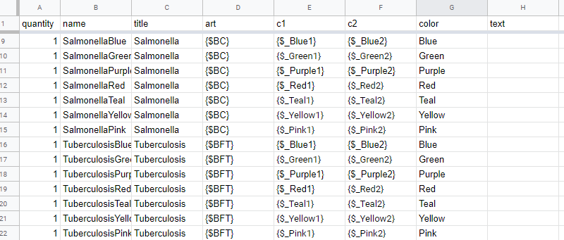
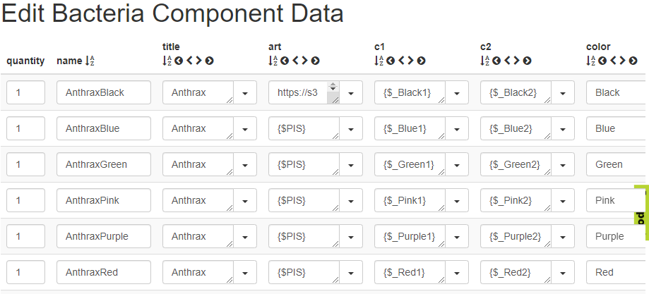
Following the import instructions on the “Data” set page, I loaded my full Google Sheet into Component.Studio. It imported, automatically, all of the values from Google Sheet. Note that it keeps the variable names exactly as they are — preview for later: the variables are substituted for the actual values when you use them in your design.
Whenever I need to make changes to my data set, I update the google sheet and re-do the import.
Creating a design and using the variable values
We’re now going to build the card template from the bottom layer up.
Background
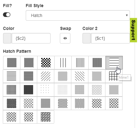
By default, cards have a white background. I want the primary/secondary striped background color. The first step is to add a shape. I used a square shape, rotated 45 degrees (the option is under advanced) and offset so that right edge formed the edge of the color on the background.
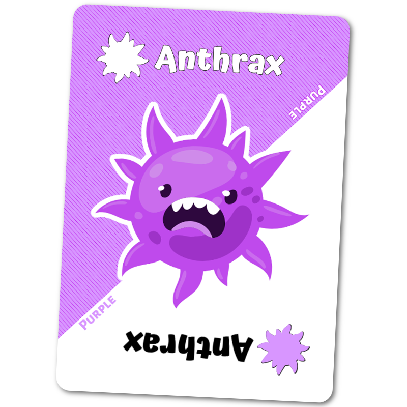
The relevant trick, however, is that I used my columns “c1” and “c2” for primary and secondary colors in combination with a “hatch” fill. For “purple”, those values for the Anthrax cards in my data set are “{$_Purple1}” and “{$_Purple2}”. The values then resolved to their HTML values that were entered into the data set variables for Purple_1 and Purple_2. If I needed to adjust the primary and secondary colors, then, I would just adjust them in the variables. Those values would propagate to every purple card.
More importantly, because the values for the primary and secondary colors are coming from the rows on the spreadsheet, I don’t need any special logic to make the background change — note that one thing that would be nice is if I could easily change the hatch type by variable, but that doesn’t seem possible.
The art!
I use the same “art” in four different ways: the center art, the two suit icons and then a special color layer. I also use the art to create a slight border around the icons. Let’s start with the feature art.
First, I add the basic art layer. This is just an “image” block. Remember that I said that I made all of the art assets the same dimensions. This fact helps simplify the next steps since I do not need special treatment for locations or sizing.
In this case, I use the data set column “{$art}” for the Image URL. This column resolves to the variable which stored the location of the relevant art file. You’ll notice that there isn’t a special purple version of this art. If you look at the data set, the same “image source” is used regardless of the color of the card. As a result, you’ll see the regular, full-color version of the art.
I won’t stand for that.
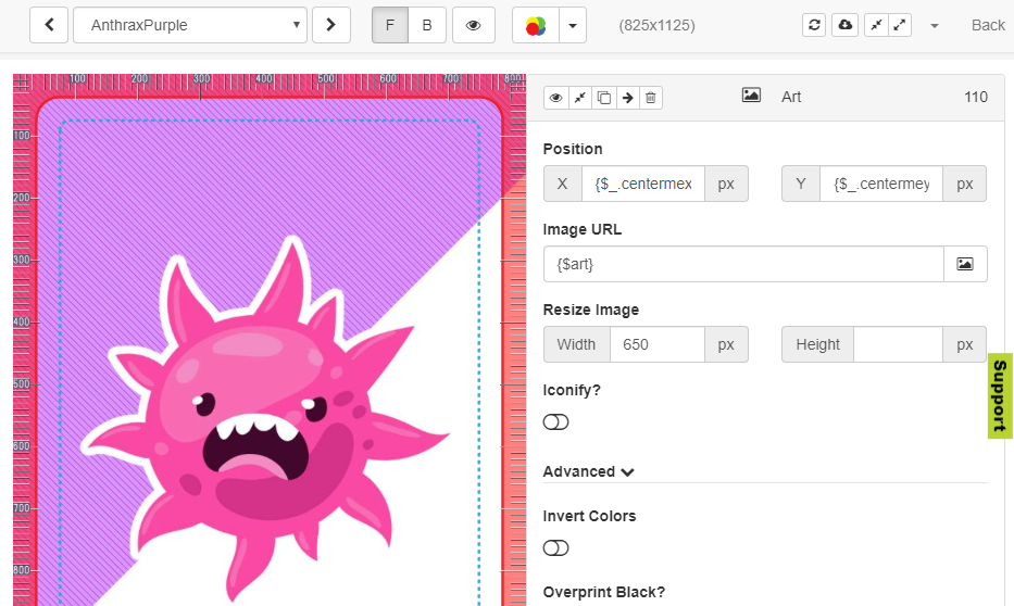
We need to make the art match the color of the current card. To do this, I’m going to duplicate the Art layer and rename it “Art Color Layer”.
Next, I’m going to use the “Iconify” option and again reuse my primary color column as the value for the icon color. Because I use transparency in my source image, I’m going to make sure that the icon retains that feature.
If I did nothing else, I’d get an ugly purple art-shaped blob in the middle of my card. That’s not particularly useful — although it is essentially how we’ll make suit icons in a second.

The real magic is to expand the “Advanced” options of our color layer. From there, we can set the transparency to 85% and also select the blending mode. If you select “Hue”, it’ll turn everything below the color layer hues of the source color (in our case the primary color).

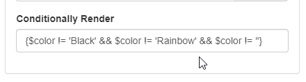
It is worth mentioning a few things at the point. The method works for standard colors of the rainbow. It will not work black & white. It’s the reason that I also uploaded black and white versions of my art. I created a special layer to handle my black suit as well as some special purpose “rainbow” cards and used Component.Studio’s built-in conditionally render option to account for those.
This conditionally render syntax basically says, use this Art Color Layer if the spreadsheet’s Color isn’t “Black” or “Rainbow” or Blank. In other words, use it for all the standard colors.
Icons
We can do something very similar to add icons to the corners of our cards. We cant again duplicate the art layer and rename the layer to icon. This layer will again use the same “{$art}” column from our spreadsheet.
We’re again going to use the “Iconify” function. For the upper-left icon, we’re going to: shrink the image to 150 pixels wide, use “Iconify?”, set the icon value to white, and keep the transparency by selecting “Alpha Transparency.”
This gives us version of the art as an icon.
We can repeat the same thing for the lower-right. In that case, the position changes and I again re-used the primary color for the color of the icon.
As we were playing the game, we noticed that for the icons, it’d be nice to have a slight border/stroke around the icons themselves to separate them from the surrounding backgrounds or whitespace. To get this effect, we created another copy of the icon layers, move them behind, and enlarged the icon dimensions just a smidge (154 pixels versus 150 pixels). Because the icon is slightly larger, we also had to change the position location so that the icon itself was centered on the border layer.
Finishing up
There are other layers in this design: text for the names and a few color text indications along the card’s center border, but with only a few layers I was able to create the basis for eighty of the cards in my 108 card deck.
It turned out that the remainder of the cards were also just variations on the same behavior. I used a single design in Component Studio and a single data set and set of variables to handle every card.
My past experience suggests that I would have had four or five different templates and I would have had to create large numbers of art files to get to the same point.
Component.Studio also let me quickly create the Print and Play files as well as the source files for Tabletop Simulator with just the push of a button.
Sneeze Crowd Sale
I redid the Sneeze cards in part ahead of putting this out for a larger crowd sale. The sale goes live on September 1, 2019: Sneeze Crowd Sale.

2 thoughts on “Component.Studio: Rapid Card Creation”